

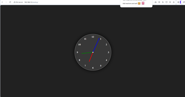
analog clock
Analog Clock Project in HTML, CSS and JAVASCRIPT
🕒 Overview of the Project
This project creates a fully functional analog clock using HTML (structure), CSS (design & animation), and JavaScript (dynamic movement). The clock updates every second and rotates its hour, minute, and second hands based on the current system time.
🧩 1. Explanation of index.html
The HTML file builds the structure of the clock.
Key Components
- <div class=”container”> — outer wrapper for centering.
- <div class=”clock”> — circular clock face.
- Three <div class=”hand”> elements for hour, minute, and second hands.
- Twelve <span> elements representing numbers 1 to 12.
How the Hands Work
Each hand uses:
html
<div style=”–clr:red; –h:84px” class=”hand” id=”hour”><i></i></div>
- –clr → color of the hand
- –h → height (length) of the hand
- <i> → actual visible bar of the hand
How Numbers Are Positioned
Each number uses:
html
<span style=”–i:1;”><b>1</b></span>
CSS rotates each number by 30deg * i to place them around the circle.
🎨 2. Explanation of style.css
The CSS file handles design, layout, and rotation logic.
Important Styling Concepts
a) Centering the Clock
css
body{
display:flex;
justify-content:center;
align-items:center;
min-block-size:100vh;
background:#212121;
}
This centers the clock vertically and horizontally.
b) Clock Face
css
.clock{
inline-size:300px;
block-size:300px;
border-radius:50%;
background:rgba(255,255,255,0.1);
border:2px solid rgba(255,255,255,0.25);
box-shadow:0 0 30px rgba(0,0,0,0.9);
}
Creates a glowing circular clock.
c) Number Placement
css
.clock span{
position:absolute;
transform: rotate(calc(30deg * var(–i)));
inset:12px;
}
- Rotates each number around the center.
- inset:12px keeps numbers inside the clock boundary.
d) Clock Hands
css
.hand{
position:absolute;
display:flex;
justify-content:center;
align-items:flex-end;
}
.hand i{
background:var(–clr);
inline-size:4px;
block-size:var(–h);
border-radius:8px;
}
- Each hand is centered.
- The <i> element becomes the visible hand.
- Length and color come from inline CSS variables.
e) Center Dot
css
.clock::before{
content:”;
position:absolute;
inline-size:8px;
block-size:8px;
border-radius:50%;
background:#fff;
}
Creates the small white dot at the center.
⚙️ 3. Explanation of script.js
This file controls the movement of the clock hands.
Step-by-Step Logic
a) Selecting the Hands
javascript
let hr = document.getElementById(‘hour’);
let min = document.getElementById(‘min’);
let sec = document.getElementById(‘sec’);
b) Getting Current Time
javascript
let date = new Date();
let hh = date.getHours();
let mm = date.getMinutes();
let ss = date.getSeconds();
c) Calculating Rotations
- Hour hand rotation
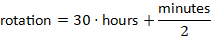
Because each hour = 30° and each minute moves hour hand by 0.5°.
- Minute hand rotation

- Second hand rotation

d) Applying Rotation
javascript
hr.style.transform = `rotate(${hRotation}deg)`;
min.style.transform = `rotate(${mRotation}deg)`;
sec.style.transform = `rotate(${sRotation}deg)`;
e) Updating Every Second
javascript
setInterval(displayTime, 1000);
This ensures the clock updates continuously.
🧠 How Everything Works Together
- HTML builds the clock structure.
- CSS styles the clock, positions numbers, and creates hand shapes.
- JavaScript rotates the hands based on real time.
- The clock updates every second, giving a real analog clock effect.
Code Files: 1. index.html 2. style.css 3.script.js
<html lang="en"><head> <meta charset="UTF-8"> <meta name="viewport" content="width=device-width, initial-scale=1.0"> <title>Analog Clock </title><link rel="stylesheet" href="./css/style.css"></head><body> <div class="container"> <div class="clock"> <div style="--clr:red; --h:84px"; class="hand"; id="hour"><i></i> </div> <div style="--clr:green; --h:94px"; class="hand"; id="min"><i></i> </div> <div style="--clr:blue; --h:130px"; class="hand"; id="sec"><i></i> </div> <span style="--i:1;"><b>1</b></span> <span style="--i:2;"><b>2</b></span> <span style="--i:3"><b>3</b></span> <span style="--i:4"><b>4</b></span> <span style="--i:5;"><b>5</b></span> <span style="--i:6;"><b>6</b></span> <span style="--i:7;"><b>7</b></span> <span style="--i:8;"><b>8</b></span> <span style="--i:9;"><b>9</b></span> <span style="--i:10;"><b>10</b></span> <span style="--i:11;"><b>11</b></span> <span style="--i:12;"><b>12</b></span> </div> </div></body>http://./js/script.js</html>
body{
    display:flex;
    justify-content:center;
    align-items:center;
    min-block-size: 100vh;
    background-color:#212121;
    color:whitesmoke;
}


.container{    position:relative;
}

.clock{
    inline-size:300px;
    block-size:300px;
    border-radius: 50%;
    background-color:rgba(255,255,255,0.1);
    border:2px solid rgba(255, 255, 255, 0.25);
    box-shadow: 0px 0px 30px rgba(0, 0, 0, 0.9);
    display: flex;
    justify-content:center;
    align-items:center;
}

.clock span{
    position:absolute;
    transform: rotate(calc(30deg * var(--i)));
    inset: 12px;
    text-align:center;
}

.clock span b{
    transform: rotate(calc(-30deg * var(--i)));
    display:inline-block;
    font-size: 20px;
}

.clock::before{
    content:'';
    position: absolute;
    inline-size:8px;
    block-size:8px;
    border-radius: 50%;
    background-color:#fff;
    z-index:2;
}

.hand{
    position:absolute;
    display:flex;
    justify-content:center;
    align-items:flex-end;
}
.hand i{
    position: absolute;
    background-color: var(--clr);
    inline-size:4px;
    block-size:var(--h);
    border-radius:8px;
}
let hr=document.getElementById('hour');let min=document.getElementById('min');let sec=document.getElementById('sec');function displayTime(){ let date=new Date(); //Getting hour, mins, secs from date let hh=date.getHours(); let mm=date.getMinutes(); let ss=date.getSeconds(); let hRotation = 30*hh+mm/2; let mRotation=6*mm; let sRotation=6*ss; hr.style.transform =`rotate(${hRotation}deg)`; min.style.transform =`rotate(${mRotation}deg)`; sec.style.transform =`rotate(${sRotation}deg)`;}setInterval(displayTime, 1000);
 Jagdev Singh
Leave a comment